We may know the meaning of a11y if we have ever heard the term i18n. Both terms have the same acronym format. If i18n stands for internationalization, then a11y stands for accessibility.
In the real world, accessibility can be defined as the extent to which an environment can be used by as many people as possible. We provide equal opportunity to everyone, including users with disabilities, to access or use an environment.
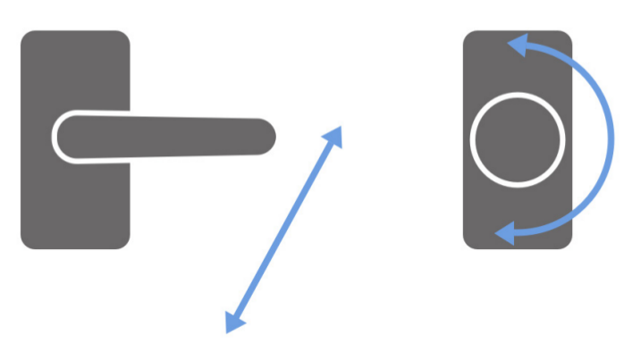
If we look around us, this form of accessibility is not only about wheelchairs. A simple example that is often encountered is a doorknob. In this world there are many shapes and designs of doorknobs. The most popular door handles are door handles and door knob.

|
|---|
| Door handles (left) and door knob (right) |
Door handles are easier to use when compared to door knobs. Handles only need a push from above to open the door. While the knob we have to grip, then turn it.
Another example, some zebra crossings play music when it’s time to cross the road. This makes it easier for pedestrians who have visual difficulties. The films we watch also provide subtitles to make it easier for viewers who have hearing difficulties. Traffic signs are made with symbols that are easy to understand so that people can quickly understand what the signs mean.
If in the context of web accessibility, accessibility can be interpreted as the extent to which a website can be used by as many people as possible. We provide an alternative way for users with disabilities to access content on our website.
Far from it, a11y can also cover a wide range of users. We can provide a convenient way for users who only access the website using the keyboard only (without the mouse). Or also provide convenient access to users who are in locations that are not ideal, such as being in the hot sun. We can design our website so that the user gets enough contrast on their cellphone screen.
To make our website more accessible, we need to begin to understand that users access a website in different ways. Ideally, they access it with a monitor, keyboard, mouse, or can also use a cellphone.
But for users who have disabilities, especially users with visual impairments, they generally use the help of a screen reader.
Screen reader is a software that reads information on the screen, and converts it into sound. With the help of a screen reader, visually impaired users can get the same information as normal users.
The working system of a screen reader is to read HTML tags on a website.
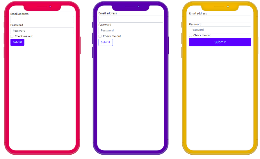
For example below, there are three website designs with different button styles. The three designs have different interpretations in the minds of users who are able to see the designs clearly. From a design like this, users will immediately understand the purpose of this website — which is to register.

|
|---|
| Different design, same HTML tags. From left to right: Design 1, Design 2, Design 3 |
However, visually impaired users cannot enjoy the design provided. They can access the content of the website through HTML tags that are voiced by the screen reader.
The HTML code of the three designs is like this.
<!-- Desain 1 -->
<div class="container">
  <form>
    <div class="form-group">
      <label for="inputEmailAddress">Email address</label>
      <input type="email" class="form-control" id="inputEmailAddress" />
    </div>
    <div class="form-group">
      <label for="inputPassword">Password</label>
      <input type="password" class="form-control" id="inputPassword" />
    </div>
    <div class="form-group form-check">
      <input type="checkbox" class="form-check-input" id="inputCheckbox">
      <label class="form-check-label" for="inputCheckbox">Check me out</label>
    </div>
    <button type="button" class="btn btn-primary">Submit</button>
  </form>
</div>

<!-- Desain 2 -->
<div class="container">
  <form>
    <div class="form-group">
      <label for="inputEmailAddress">Email address</label>
      <input type="email" class="form-control" id="inputEmailAddress" />
    </div>
    <div class="form-group">
      <label for="inputPassword">Password</label>
      <input type="password" class="form-control" id="inputPassword" />
    </div>
    <div class="form-group form-check">
      <input type="checkbox" class="form-check-input" id="inputCheckbox">
      <label class="form-check-label" for="inputCheckbox">Check me out</label>
    </div>
    <button type="button" class="btn btn-outline-primary">Submit</button>
  </form>
</div>


<!-- Desain 3 -->
<div class="container">
  <form>
    <div class="form-group">
      <label for="inputEmailAddress">Email address</label>
      <input type="email" class="form-control" id="inputEmailAddress" />
    </div>
    <div class="form-group">
      <label for="inputPassword">Password</label>
      <input type="password" class="form-control" id="inputPassword" />
    </div>
    <div class="form-group form-check">
      <input type="checkbox" class="form-check-input" id="inputCheckbox">
      <label class="form-check-label" for="inputCheckbox">Check me out</label>
    </div>
    <button type="button" class="btn btn-block btn-primary">Submit</button>
  </form>
</div>
The difference is only in the class of the <button> tag. But if we look at the whole code, all three designs have the same HTML tag structure. This HTML tag will be consumed by users who use screen readers.
So it is very crucial to use the right HTML semantics. If we want to create button components, use <button> and avoid other tags to create buttons. We could just create a button from <div> or <a> and design it using CSS to look like a button. But such a way does not increase the a11y of our website.
If you want to learn more about a11y, you can read about it from the site a11yproject.